Imagine a world where every visitor in your site reads your posts word per word.
Imagine every user spending a minimum of 30 minutes to an hour just basking in the glory of your genius.
Now, stop.
That world does not exist.
It may suck to know this, but the reality is that every post would probably get an average on page time of 10 seconds or even less.
But, all hope is not lost.
It may be impossible for all your readers to spend more time on your page, but there are ways to attract a decent number of visitors to stay longer.
Reality check
First things first.
Let’s be real and accept this reality: only 2% of your visitors would actually spare more than two minutes on your posts.
An even lower number would end up reading the entire thing. But, there is good news in store for you.

You don’t have to be stuck working on a run of the mill blog. There are actually ways to turn things around and make them better.
The goal is to figure out the factors that influence the average time your visitors spend on your page.
The key is being open to making changes which, depending on your blog or website, may either be minor tweaks or some major overhauls.
What is average time on page?
Let’s start with the basics.
Unifusion says that the metric used to measure the average on time on page traces the time your visitors spend checking out a specific page.
Google starts the calculation the moment the user goes in your website and clicks on a link to get to the next page.
Take note that this does not include the time they spent on the last page though.
Why is average time on page important?
The past years saw Google release a couple of updates linked to the search engine algorithm.
These included Hummingbird and Panda as well as Penguin.

The updates served as guides for website owners in terms of their link building efforts, which affected their incoming links and even the usage of anchor texts applied to their outgoing links.
Although the updates set the rules for these factors, the guidelines for measuring on-page SEO never really had major changes.
Actually, users remain as the primary focus of on page SEO tasks.
In a nutshell, Google just wants users to enjoy their every visit to your web page.
This is where the average on page time comes in.
When Google sees that users spend a lot of time on your page, it interprets this to your advantage.
It means they are engaged in your content and are actually willing to spend time checking out your site.

So, you should aim to be as interesting and engaging as possible if you want to retain the attention of your users and in turn, get a high ranking from Google.
Aside from that, a high on page time could also serve as a strong indicator of what you are doing right.
By figuring out your bounce rate stats, you can actually determine how to take advantage of certain pages to help you formulate more effective calls to action.
Check out these 5 proven ways to improve your on page time.
1. Pick up the load speed
If you’re one of those people who think that the website’s speed is a minor factor to users, then you probably need to re-evaluate your strategy.
Let’s break this down in numbers to paint a better picture.
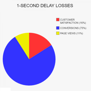
Every one second of page load delay costs you a whopping 16% decline of customer satisfaction. You also suffer 11% less page views and a heartbreaking 75% loss in your conversion rate.
Remember Google’s primary concern? Yes. You just botched that in a snap with a slow page.

According to the e-commerce giant, every 100 milliseconds of improved site speed resulted in a 1% rise in their revenue.
Here lies the rub though.
The problem is, an average user only wants to wait for two seconds. So, where do we go from here?
One way is to decrease your server response time. You can also enable browser caching in your website or even get rid of plugins to improve your load speed.
Google advises website owners to make use of web application monitoring apps. These could assist you in figuring out where the bottlenecks are and help you apply the right solution.

You can use resources like Yslow to assess your website’s load speed and even receive tips develop your site better.

The PageSpeed Tools by Google offer great info on how to automate improving your website performance.
2. Check for technical issues
Getting a high SEO ranking is crucial to the success of your website.
Before you worry about how much time users spend on your page, you would need to think of ways to get them to visit it in the first place.
Technical issues could be the bane of your business, so it’s best to ensure that your site is not suffering from them.
After all, who wants a site with indexing problems, no XML sitemap, or even coding glitches?
Take advantage of their Website Auditor tool to help you analyze your site and pinpoint technical concerns of certain pages.
One problem that could be hurting your SEO involves URL errors.
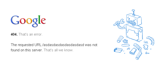
This happens when users are welcomed by 404 pages. DNS and server errors also negatively impact your ranking.

Broken links can also mess up your website.
If you’re a hotspot for broken links, then get ready to be tagged as an inaccessible site by the search engines.
It’s pretty easy to fix this though. Just make sure that you only use healthy internal and external links in your site.
Code errors are a big no-no as well.
While codes are generally a good thing, do not overdo it.
Excess codes, which obviously carry on page JavaScript and CSS, usually make it slower for search engines to crawl your website.
So, make your codes as lightweight as you can.

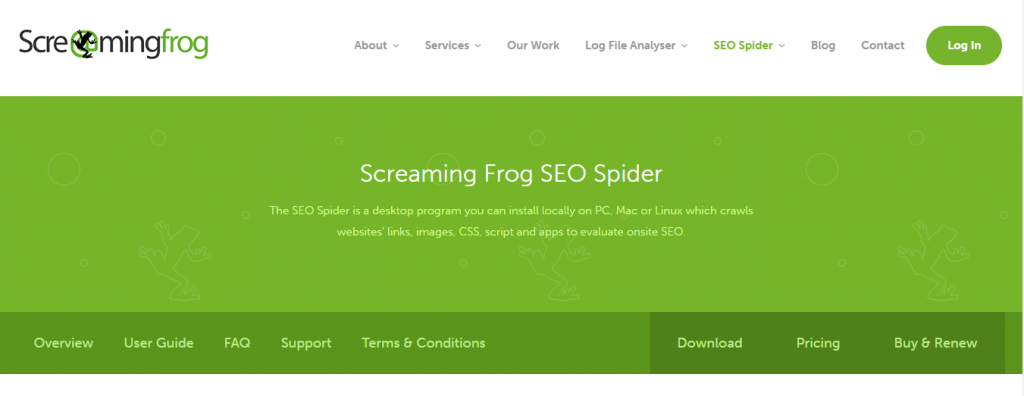
You can check out Screaming Frog’s SEO Spider to sniff out broken links in your site. It can also help with other SEO-related concerns.
3. Guarantee quality content
It has been said time and time again: content is king.
The easiest and most direct way to improve your average on page time is to offer in-depth quality content.
Regardless of the keywords, web pages that earned a spot in the top 10 results on Google had a minimum of 2,000 words.
Posts with higher word counts steadily beat their counterparts with shorter content.
Although these facts might drive you to churn out really long posts, you must take note of the human interest factor.
Spouting gibberish just to reach a high word count would have your readers scurrying to get out (and probably stay out) of your site.

Your content is your communication line with your readers.
Quality in-depth content could help you boost your reader retention by a staggering 88%.
You can also expect an 87% increase in your brand awareness.
The challenge would be to keep their attention focused on your content. People nowadays have shorter attention spans than the average goldfish.
So, how can you encourage them to stay longer and actually read your work instead of just skimming it and moving on to the next site?
Consider using lists or a table of contents.
Modern users have unique ways of looking at digital content.
Experiment with social media, too. Not only does it break up your long posts, you can also utilize this to boost your traffic.

More often than not, users just scan the posts and look for the concepts that they find interesting.
So, try to make your content easy to scan and understand without sacrificing the quality. Try putting across your point using short paragraphs.
You can also maximize the use of headers to make your ideas more digestible to the readers.
4. Make formatting a priority
Regardless of how awesome your website is, the first thing users see is the format. This could make or break your on page time.
Visitors could easily get turned off with websites that have poor layout.
Can you just imagine browsing a site that has ant-sized text? What about those that have giant poster sized words?
Would you actually have the patience to scroll and check out the entire site?
Unless you desperately need something from that site, chances are you’ll hit the exit button and never return again.
Studies showed that the ideal width for your text would fall anywhere from 55 to 100 characters.
Others put the mark at 66 characters for every line, but that would be up to you and your site’s design.
As frivolous as it may sound, you should pay close attention to your font size and type.

As for your blog width, most sites claim that the ideal would be at 500 to 650 pixels.
Ultimately, the decision is up to you and how you want your blog to look. Just keep in mind that your readers encounter millions of entries per day.
So, they often just scan posts to see if anything interesting pops out.
If they find something they really want to know about, then they would read slower and spend more time on your site.
Keep those in mind when you choose your fonts, style, and character count.
5. Make it as visual as possible
Human beings are naturally visual creatures.
Readers respond better to posts with a lot of images like graphs and charts as opposed to a pure text content.
Simply put, visuals make everything a lot less boring and way more interesting.
Visual content is so powerful that posts with relevant images actually receive 94% more page views than those with no relevant pictures.
Don’t worry though. You do not need to be a Photoshop expert or a professional photographer to come up with great visuals for your site.

Canva’s incredible functionality makes it a go-to image builders among website owners. It’s also pretty simple to use because it offers drag-and-drop tools in building your own graphics.
You can also just opt to use their ready-made templates, which have been customized based on the platforms you want to use them on. The best part of it all is that it’s free.
Another tool is Pablo, which is an app from Buffer. Like Canva, it offers drag-and-drop options. Since it’s linked with Buffer, its features are tweaked to fit the demands of social media posts.

Conclusion
Remember, your goal is to make sure that users are interested enough to not only stay longer on your page but also return to your website.
You do not need to make drastic changes just to encourage your visitors to spend more on page time on your posts.
You just have to determine the factors that are probably hindering them from enjoying your site.
If you do not know which aspect to tackle first, ask yourself this question: What pushes me to keep scrolling?
Jr


0 Comments